What I want: Metro + Desktop fusion edition
Longtime readers may remember that ages ago I used to write occasional posts with the title “What I Want: <some topic area>.” It’s been awhile, but I’m going to try bringing that back, starting today.
I’ve thought about and wanted this particular thing for a long time, but figured that now is as good a time as any to jot down my thinking for blending the Windows desktop and Metro/Modern/Immersive environments. I guess I’m partly inspired to blog about it because of Joseph Machalani’s post “Fixing Windows 8” he published back in December. I loved his approach of laying out concept and principles, and then showing mockups of how his proposal would work.
I’m not going to spend anywhere near as much time on this post as Joseph clearly did on his. I’m also not going to draw anything as pretty or make slick videos. Sorry. I have code and app building posts to write 🙂
What I will do is try to lay out my thinking for how I would tackle the same problems Joseph discussed. And I’ll share some quick and dirty mockups of roughly how it would work. Maybe one of my old pals at MSFT (or whoever is running design in Windows now) will like something from it and be inspired. Or maybe they’ll hate it. Or maybe they’re already thinking along the same lines. Whatever the case, I think it could spawn an interesting discussion.
Disclaimer: I have not shared or discussed any of this with anyone from Microsoft, and have absolutely no knowledge of their plans other than being aware of the rumors documented on The Verge and other places in recent days. This is nothing more than my musings as an enthusiastic user, developer, and wannabe designer.
So let’s begin with a little background from my perspective…
Simplicity versus capability
By and large, the world of computing UX is dominated by two approaches.
Apple uses both approaches. They ship the iPad with a simple UX, and the Mac with a powerful one. They’re largely unrelated experiences. One is not a scaled down or scaled up version of the other. They were designed independently, with vastly different goals.
Along the same lines, Windows Phone (7+) and Windows 7 easily fit into the same respective buckets.
Windows 8 — Mashing things up
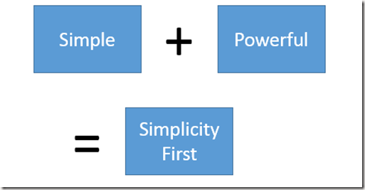
I believe the designers of Windows 8 saw value in both approaches and set out to build a UX with the best of both worlds. I think the formula they used was essentially this:
I don’t think this was a crazy idea. In fact, I think this exact concept is valuable in some situations. The problem, I think, is that it fails to address 100% of the existing “Simple” and “Powerful” buckets. And yet, Microsoft decided to pitch it (and deliver it) as the modern replacement for those concepts it decided were legacy. And frankly, I think there’s more market today outside of the segment “Simplicity First” can address, on either side.
My alternative — a scalable UX
Rather than billing a single Simplicity First UX as all you need, I think what we need is a scalable UX.
Some devices (and users!) lend themselves to simpler UX, and this should be embraced. The iPad is a great example of this. Many, many users (and pundits) find its limitations to be a feature. I think a truly unified UX needs to start here and be able to exist completely in this bucket.
At the other end of the spectrum, you have what I’ll call a “Capability First” UX. Apple has slowly (very slowly) started pushing Mac OS to fit here. Things like LaunchPad and full-screen mode give the user a way to toss off the complexity of their normal desktop environment when they’re in the mood. And the way they’re doing it involves bringing some elements of iOS into the Mac world.
Why no “Powerful only” segment at the top of the scale? I just don’t think it’s valuable. As is, each step in the scale is a superset of functionality, just prioritized differently.
Microsoft has already shown that the design language and UX model formerly known as “Metro” can scale from Simple to Simple First. Windows Phone is Metro in Simple mode. Windows 8 is Simple First.
Unfortunately, with Windows 8 and Surface, Microsoft missed two important things. First, they failed to address the market for a Simple UX on a device any larger than a phone. Second, they failed to deliver the Capability First UX that traditional PC users demand for their desktops and most laptops.
A note on Windows 8.1 and update rumors
Windows 8.1 takes some really tiny opt-in baby steps to addressing the Capability First crowd (mainly by allowing you to boot to the desktop). The benefit of that is something that, today, I find questionable. And it’s off by default, so hard to call it capability first.
The other change in 8.1 was the restoration of the Start button on the desktop. There are two small benefits to this. First, it partially solves the discoverability problem of the lower-left corner mouse trigger for getting to Start (I say partially because it doesn’t help when you’re not in the desktop!). But second, it lets users feel more rooted in the desktop, whereas 8.0 was all about Start being the root and desktop being essentially an app.
For an OS update that took a year, and has a lot of great new stuff (SkyDrive integration, vastly improved Metro window management, lots of platform improvements, etc), these changes felt more like reluctant low-hanging-fruit concessions than earnest investments.
However, rumor has it that the upcoming “Update 1” will push further in this direction. Given the timeframe, I expect there will still be a lot of seams as you move up or down the scale I proposed above. But for an update put together over a few months, the rumors seem compelling enough. More than their functionality alone (which I’m anxious to see firsthand), it’s promising to see the new Windows leadership taking real steps here, and doing it with such agility.
Of course, I still have reservations. In particular, about how they’ll pursue this apparent “back to the desktop” objective in future releases. Naturally, since this is my blog, I have some ideas to share about that…
Scaling Windows from Simple to Capability First
Here I’ll describe how I’d take Windows from Simple to Capability First. We’ll start at the top, which is where things change the most.
My Capability First model
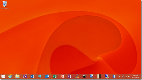
Well let’s get the obvious out of the way. This is Windows, so our Capability First UI is going to start out like this:
I bet I know your first question. What happens when you click that Start button? Here’s where I get a little crazy. Instead of opening a Start “menu” or taking you to the Start screen, that button really becomes the “new window” button.
Quick reminder: These are quickly hacked together mock-ups to convey the idea. Don’t judge the details!
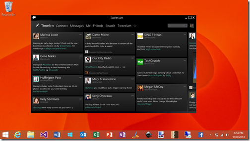
Clicking on that button gives you a new “blank” window. Well, not entirely blank. It shows you Start. In other words, all the things that window can become. It could show a revised version of Start with recently visited documents or links, but the core idea is that it’s an evolution of the Start we know from Windows 8.1 today.
Selecting an app, whether it’s a Store app or a desktop app, turns this window into that app’s window.
(Ignore the fact that it doesn’t have a taskbar entry, just another case of me being lazy with the mockups)
Reimagining windows, not Windows
Today, the user starts applications, and applications create windows. Sometimes they’re desktop windows, sometimes they’re “immersive” windows. They act differently, and the user really has no control over which sort of window they get.
What if we turned the paradigm on its head a bit and said that the user creates windows, and windows are an organizational construct for hosting apps (and documents, and web sites).
Instead of the desktop being an app inside of the immersive environment, the desktop would be a place where every window is its own immersive environment. It’s own workspace. Indeed, maybe we can distinguish this concept a bit and instead of just calling it a window, call it a workspace, or a workspace window.
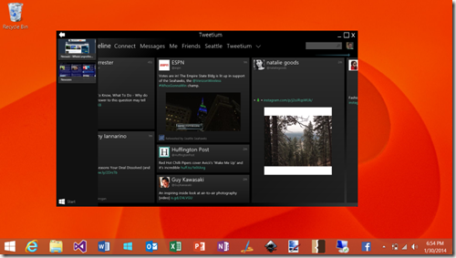
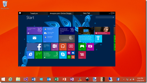
That means it has its own “back stack.” It could also have its own tabs. If something about this feels familiar to you, it should. The ultimate evolution of this idea would unify the browser’s tab and navigation stack concepts with the window manager completely. I don’t see why one tab can’t have an app like Tweetium and another tab have www.amazon.com in it. How the browser has remained its own window-manager-within-a-window-manager for so long is puzzling to me.
The idea then is that if you grab that window’s titlebar and drag it to the top of the screen, or you click the maximize button, you’re in today’s immersive mode.
Grab it from the top (as if you were going to close or rearrange it today) and you can restore it to some position on the desktop. Then you can grab another workspace window and maximize that, essentially taking you back to the “metro shell” but with just the windows in that workspace.
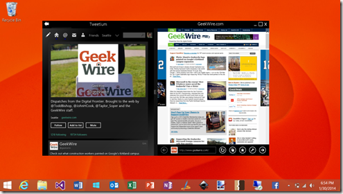
Since this is the same window manager we already know (and sometimes love) from the Windows 8 “Metro” environment, maybe we can do things like snap windows inside it.
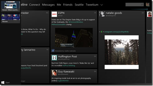
Another cool feature of this would be the ability to pin a workspace arrangement to the taskbar. Then any time you clicked on that taskbar entry, you’d get that set of apps loaded into a workspace window. Maybe two are snapped side-by-side in it, or maybe you have Newseen and Tweetium in separate tabs of the same workspace window.
If we did have tab support in these workspace windows, then “New Tab” is basically Start.
(last reminder that this is about the UX concepts and interaction model, not the graphical design!)
Of course, just like the browser today, you’d be able to drag tabs between workspace windows, or out into their own new workspaces.
Could classic desktop windows participate in the tabbing and such? Maybe not. I can imagine several technical challenges there, though possibly solvable for at least some cases. But even if not, I don’t think that would be a problem.
Scaling it down
The model above shows how I’d love Windows to work on my desktop and laptop. On my tablet, though, I might want something different.
For a Simple First variation, you’d just boot to a maximized workspace showing Start. You can always take it into the desktop if you want, but that functionality is tucked away until you need it (which maybe is never).
On the simplest devices, like an 8 inch consumer-level tablet, you may want to lock the system to one workspace. Basically, today’s Windows 8.1 but without the desktop available at all.
What do you think?
I’d love to hear what others think of this UX model. Love it? Hate it? Have ideas about how to make it better? Or a better idea? Jump into the comment section and let me know 🙂
Comments are closed.



I would actually put more focus on what I think you mean as “Capability First”. I got my feet wet creating software that would need a version for a C64/128, Apple II, Mac, Deskmate, GEOS, Amiga and finally Windows.
Our mantra was “Intuitive” interface. Our goal was to design a screen so our software would react properly to what the user did without a thought. Each machine at the time had taught its user their way to do something.
Thankfully, over the years many computer actions have merged, Mod key + A, Z,X,C,V are good examples. Other things are intuitive to people even if they never used a computer. Apple did a huge study to decide the Close/Cancel key should be on left and action key on the right. Windows users learned the opposite behavior. You can tell on some web pages what kind of machine the author uses.
Basic intuitive behaviors are still applicable to Windows 8 and should be used instead of someones opinion. Some things remain intuitive like which position of a light switch is on. Which way a door opens depending on it’s handle. These basic intuitive design conditions still apply.
Bill
Very nice article, thanks.